Friday, September 5, 2014

WIP Zbrush model of Colin character - Spring 2014 Intro Zbrush class


Character 1 - Two pilot/ driver designs - Spring 2014


Character Design 1 Redesign Project

I chose Adventure Time animation style and plot line/ characters from Tucker & Dale vs. Evil. This was a fun yet difficult project to do. I now appreciate this 2D style animation even more than before. 

***Disclaimer ... This project was for created for a class at Art Center College of Design. This is not being used for professional purposes, only for learning. ***


Tuesday, January 14, 2014

3D3 Maquette: Pacific Rim Kaiju Redesign

We were given the choice between redesigning the Kaiju or Jaeger from the movie Pacific Rim ... I wanted to challenge myself with an organic form, so I chose to create a kaiju. I have had some practice with more facetted and geometric sculpting from a previous class, so this was a great exercise! 

I was very fortunate enough to have two very talented, kind, and outgoing teachers for this class - Miles Teves and Bill Basso. The opportunity to work with professionals within the industry is always such a treat! I can never thank them enough for all of their help. 

Between their constructive criticism, lots of encouragement, and hard work on my end, my kaiju was placed in Art Center College of Design's student gallery. This is such an honor, especially since this is the 2nd time I've gotten in because of my sculptures. I hope to continue that pattern in the coming terms. 

Thank you, and please enjoy!


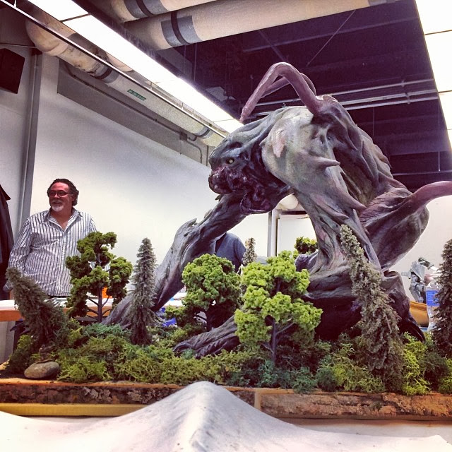
I created a diorama to show the scale of the forest kaiju, which is supposed to be 200 ft. tall!


I placed WWII kit models into my diorama to make it feel more authentic and to push the scale of the maquette. Here you can see a tank attempting to approach the kaiju.


This was me working on the clay stage of the model. We used a chavant clay, alongside with a two-part magic clay for the hands and feet. Very messy, but satisfying!


The wire armature on the right was my first attempt, which turned out to be too small! So I remade it in class, and the second one was good to go!


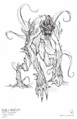
We were told a week before the class started to have a design nailed down and ready to start building on the first day. Here is my only action sketch that I had to work with for the entire maquette. The rough ortho above this was a quick way for us to start our wire armature for scale and proportion. 


Sunday, January 12, 2014

Digital Landscape Painting: Digital Plein Air

During my 4th term at ACCD, I took a Digital Landscape painting class with Jaime Jones. This was the first time I had ever plein air painted. This was a true challenge for me in both painting outside in the elements, and also with environments. I really learned a lot from this class, but I still have a long way to go! 

This first painting was of the Pasadena City Hall. 


First time painting at the Eaton Canyon in Pasadena, CA.


First time painting at Descanso Gardens, CA. 


Second time painting at Eaton Canyon. 


This was a final project we were told to illustrate with no particular subject matter, other than it had to have some form of person or object for scale, a play with lighting, color, and scale within the painting. I chose to create a very light hearted/ victorious scene of a viking ship coming home from a victory, bringing the sunshine with it. Blowing all of the bad winds away.


In class observational drawings

These are each 5 mins each while finished in class observing a model, using Photoshop. From my 4th Term Costume Design class. 

Viscom 4: Dynamic Sketching for Product Design

During my 4th Term at Art Center College of Design, I decided to replace my major's Viscom 4, with the Product Design Vis4. I found that this class taught by Peter Han and TA's Xiao Qing and Patrick Park was a wonderful way to get back to the basics of hand drawing from observation. 

For our final, we had to scan all of our work from the entire term (14 weeks) and create a book. There were no requirements as to what the book should look like, alongside with the final presentation of the book. These images show a few pages from my 144 page book that I self bound. I used a traditional simple Japanese Stab Bind. 

In turn, I found my inspiration from traditional Japanese packaging methods. I also wanted to incorporate the idea of getting back to basics, back to nature. My mojo for the term and for this class was "let it go. let if flow. let it grow." The characters on the front of my presentation means "to grow." 

I hope you enjoy this project as much as I did. Thank you for your time!